Why Responsive Design Matters
🗓 September 2025 | 🕒 5 min read
In today’s digital-first world, mobile isn’t optional — it’s essential. More than 60% of web traffic now comes from smartphones and tablets, and users expect websites to function seamlessly across all devices. A site that looks perfect on desktop but breaks on mobile frustrates visitors, reduces engagement, and can harm your search engine rankings.
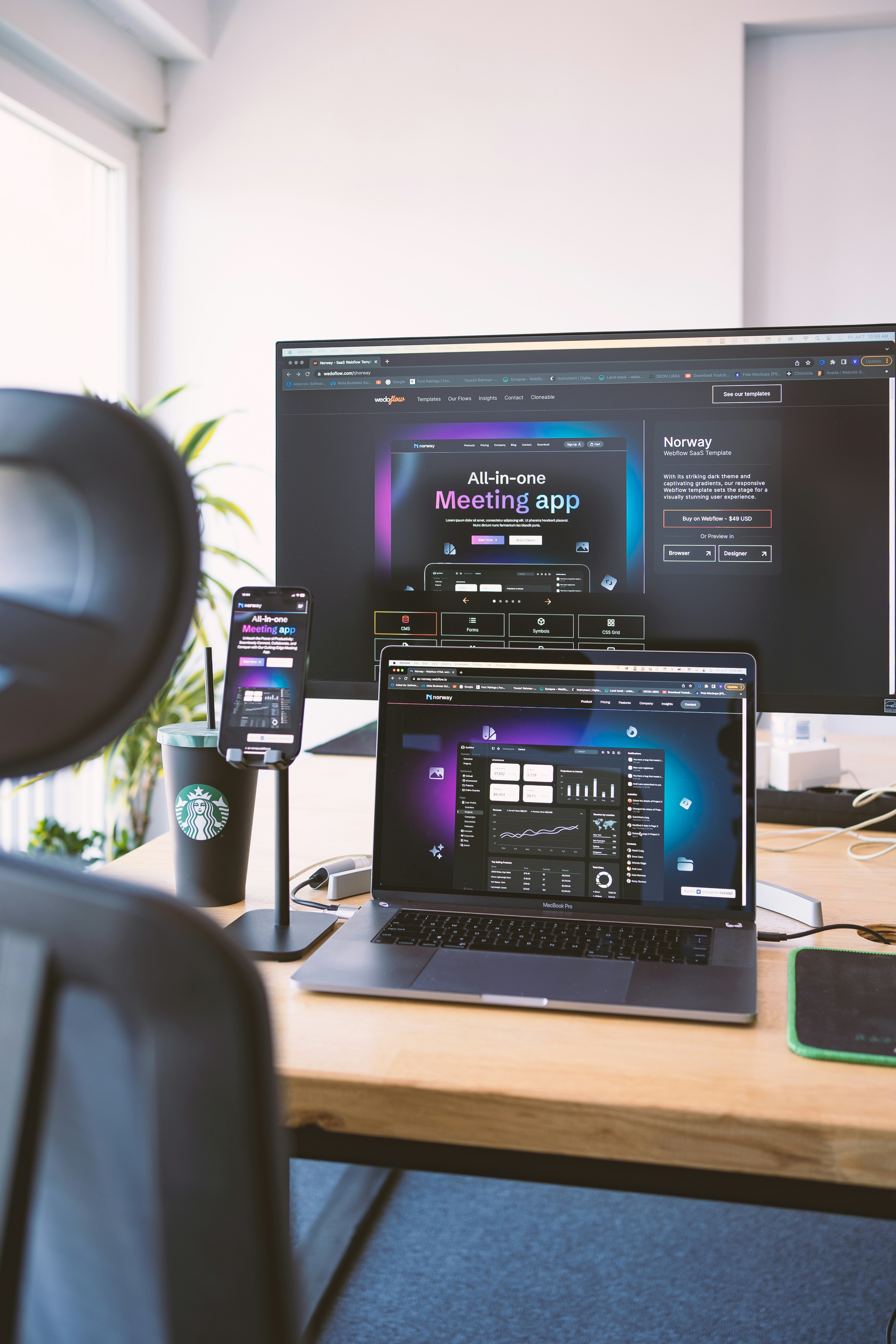
Responsive design ensures your website adapts to any screen size, automatically adjusting layouts, images, and text for optimal viewing. Beyond aesthetics, it improves usability, keeps users on your site longer, and helps you reach a wider audience.
Better User Experience Across Devices
Users expect consistency. Buttons, menus, and images that appear perfectly on desktop may be unusable on a small screen. Responsive design solves this by: Adjusting layouts to fit the screen Scaling images appropriately Ensuring text is readable without zoomingSEO Benefits
Google prioritizes mobile-friendly websites in search rankings. Sites that aren’t responsive risk lower visibility, fewer visitors, and lost opportunities. Actionable tip: Use Google’s Mobile-Friendly Test tool to check your pages. Ensure font sizes, buttons, and images adjust correctly on mobile screens.Cost-Effective and Easier Maintenance
Instead of building separate sites for desktop and mobile, a responsive website uses a single codebase. This saves time and reduces long-term maintenance costs.Faster Page Loading
Responsive design often involves optimizing images and layouts for smaller screens, which reduces load times — crucial for keeping visitors engaged.
Future-Proofing Your Website
New devices with varying screen sizes continue to emerge. Responsive design ensures your website adapts automatically without requiring major redesigns.
Conclusion
Responsive design isn’t just a nice-to-have; it’s essential in a mobile-first world. It improves user experience, boosts SEO, saves costs, and future-proofs your site.
By prioritizing responsive design today, you ensure that your website is accessible, usable, and competitive across every device — which is exactly what modern users expect.

About the Developer
At NexaDigital, we take responsive design seriously. As a team of passionate developers, we believe that every website should deliver a seamless experience across all devices. By prioritizing mobile-first layouts, optimized images, and intuitive interfaces, we ensure our clients’ websites not only look great but also perform flawlessly. Whether it’s a personal blog, an e-commerce platform, or a corporate website, our goal is to make technology feel effortless for every user. With NexaDigital, responsive design isn’t just a feature — it’s a standard we live by.